While watching tutorials I discovered an aspect of DaVinci that I was not aware of; getting rid of marks, moles, stains on clothes etc. Below is an example that I did myself. Its a short clip of myself in which I’ve got rid of a small mole on my neck. To do this I masked around it, tracked it, blurred the mask, lowered the mid-tones and reds and raised the input saturation. This was a good opportunity to test the tracking capabilities. I decided not to use natural light as I wanted to check how far I could push it with neon lighting. I was surprised how well it worked. There is a slight ring outlining the mask that can be seen but for the purpose of this video, I left it.
Analysis of use of colour in film.
Colour is one of the most effective tools in conveying the mood of a story. Whether that’s through colour grading or use of colour pallets. Colours can; Elicit psychological reactions, draw focus to significant details, set the tone of the movie, represent character traits, show changes or arcs in the story (Risk, 2016).
A great filmmaker should know what colour pallets to use with what film. Tim Burton is a great example. Burton’s films usually consist of; strange characters that are outcasts, gothic designs and the negative portrayal of pop culture. It can be argued that these three points can be contributed to his use of colour. His film ‘Edward Scissorhands’ best amplifies this. Tim Burton is known notably for the use of dark colours. However, this film uses pastel colours to represent 1960’s America and possibly the American dream.
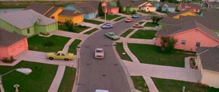
The use of these colours conveys a friendly, un-threatening tone to the film. However, the neighbourhood grows less accepting of Edward showing that they are gentle on the outside but ruthless and judgmental on the outside. A connotation of society when unaccepting of others. The film’s colour is also reminiscent of Burton’s other work. It’s easy to notice what Burton likes to use so much because of all the other ones he avoids (CineFix, 2017).
Filmmakers often build a colour pallet involving a selected limited range of colours instead of using all available such as reds, yellows, greens, blues and purples. A colour pallet is a full range of colours that can be displayed on a device screen or other interface, or in some cases, a collection of colours and tools for use in paint and illustration programs (techopedia).
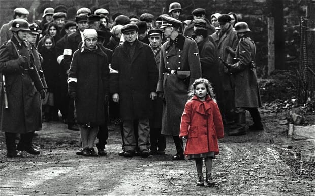
One of these more specific colour pallets is the selected saturation palette. This means that everything in the scene is black and white except for a specific object that gets the most vibrant colour. This is most notably used in the film Schindler’s list. Not necessarily as a way to move the narrative along but as an emotional effect as seen below.
Another example of this being used is Sin City. Which uses this technique emotionally and narratively. The decision to include any colour has clear intention so the audience has no choice to focus their attention on that.

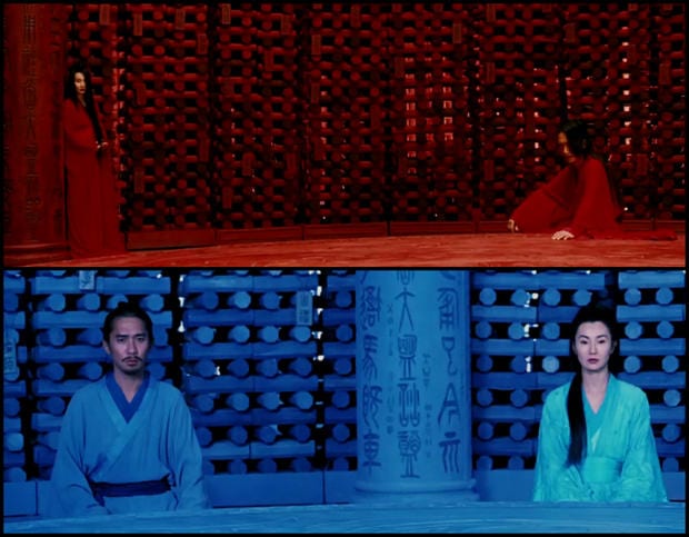
Next is that use of monochrome palette. This essentially means the use of one colour. David Fincher uses this to convey rigid worldviews of unbalanced characters. For example, in The Social Network. But one of the most impressive examples of this is from 2002’s Hero. The film tells and retells one story three times: how an anonymous assassin in ancient China overcomes three rivals. Two of the versions are false, one true. And they seem to come from different worlds: a red one, a blue one and a white one… Add to this a frame tale dominated by shades of black, and a series of flashbacks infused with vibrant greens, and you have a film that functions like a prism (Mackey, 2004). Despite the variety of colour used the film is consistent with the use of monochrome as seen below.
The complementary colour pallet. You take one colour and combine it with its opposite on the colour wheel. For example, red and green, yellow and purple and the popular Hollywood blockbuster look, orange and teal (Blue). It’s fun to complain about and it can definitely get stale, but filmmakers use it for a reason, it’s the colour contrast that best emphasizes the look of human skin (Cinefix, 2017).
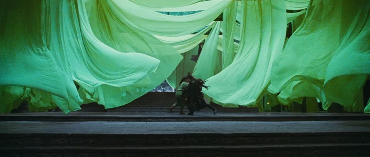
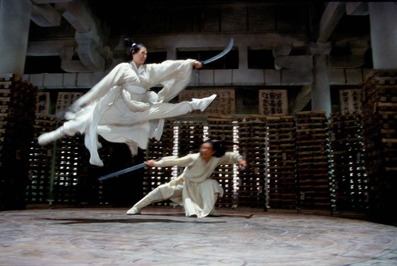
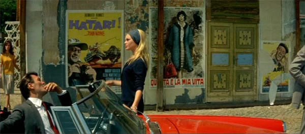
triadic and tetradic colour schemes are the use of having 3 or 4 colours. They can make for effective colour schemes, ones that tend to seem fun and carefree and stereotypically colourful films. The use of colours such as red, blue and yellow can easily be overbearing but in some cases when done right can be beautiful, striking, thoughtful and memorable. Such as films like A Clockwork Orange or Contempt.
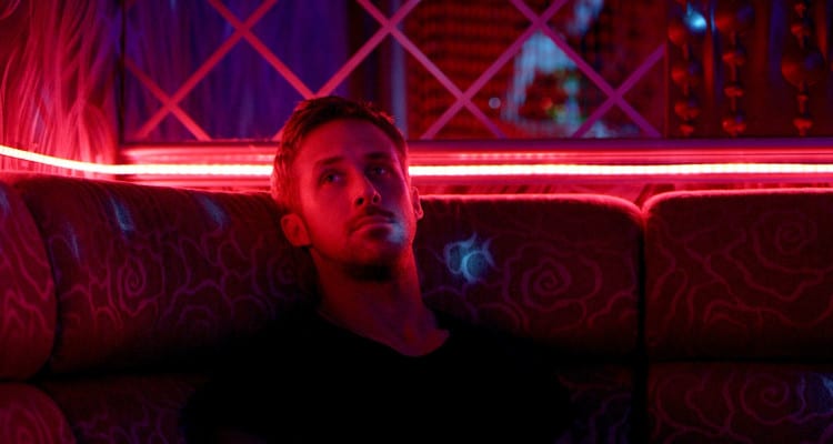
The neon colour pallet used bright colours and high saturation. Films such as Blade Runner and its sequel Blade Runner 2049 use this as a way to convey the futuristic setting. A personal favourite of mine aesthetically is Only God Forgives. The screen is nearly always black or immersed in a neon glow. The film uses this along with monochromatic compositions (CineFix, 2017). A consistency throughout the film is that there is no gentle colour, everything is harsh, contrasted an unnatural as seen below.
Pastel colour pallets work in as the polar opposite to neon. Neither very light or dark. This aesthetic is washed out and milky. Most notably the director Wes Anderson has become somewhat a master of using pastel colours in his films. One example of this is his masterpiece The Grand Budapest Hotel. Soft gentle forgiving colours never neon, rarely primary often peculiar and difficult to name. Andersen doesn’t use yellow so much as mustard, not pink so much as Rose, not red so much is burnt umber there’s a sophistication to his colour choices that is a little bit hipster (CineFix, 2017).
Now the different types of colour methods have been described it’s important to understand how or if these contribute to the films. Some film critics believe that you can often at times glance at a movies colour and instantly tell its genre; Warm red tones for romances, desaturated colours off apocalyptic films, blue cold tones for Horrors, fluorescent greens for sci-fi, yellow tones for film based in the desert saturated vibrant red tones for comedies and for everything else orange and teal (The Verge, 2015). At the start I stated colour can; Elicit psychological reactions, draw focus to significant details, set the tone of the movie, represent character traits, show changes or arcs in the story.
Colour was initially used to show the dreamlike quality of cinema. The fictional visual medium was the pinnacle of escapism, so colour was used to show how distant from our reality it was. It didn’t take filmmakers too long to discover that colour was an essential component of storytelling (Channel Criswell, 2015).
Benjamin Christiansen a Danish director who made films between 1911-1942 realised our inherent psychological reactions to different colours. We would feel much more on edge when the screen was covered in red which contrasted to the much more tranquil shots submerged in blue (Channel Criswell, 2015). Filmmakers quickly caught on that colour was a way to symbolize and thus a new way of metaphoric storytelling was born. The first film to show this was Greed (1924) by Erich von Stroheim. This film is considered one of the finest and most important films ever made. It follows the story of a man whose wife wins the lottery. The money is hand-tinted a golden colour. By the end of the film as the man’s possessiveness grown the entire film is engulfed in a yellow tint, symbolizing the man’s consumption. Humans will always have distinctive psychological reactions to certain colours and so particular colours are often used in a very particular way. But, that doesn’t make colour use exclusive. For example, red seems to be the colour that we have the strongest reaction to but where one may use it as a depiction of hate and cruelty another may use it to show passion (Channel Criswell, 2015).
CineFix (2017). 10 Best Uses of Color of All Time. YouTube, [ONLINE] Available at: https://www.youtube.com/watch?v=tILIeNjbH1E&t=637s. [Accessed 24 April 2018].
Channel Chriswell (2015). Colour In Storytelling. YouTube, [ONLINE] Available at: www.youtube.com/watch?v=aXgFcNUWqX0. [Accessed 24 April 2018].
Mackey, R (2004). FILM; Cracking the Color Code of ‘Hero’. New York Times, [ONLINE] Available at: https://www.nytimes.com/2004/08/15/movies/film-cracking-the-color-code-of-hero.html. [Accessed 24 April 2018].
The Verge (2012). How filmmakers manipulate our emotions using color. YouTube, [ONLINE]. Available at: https://www.youtube.com/watch?v=0ZZgiSUyPDY. [Accessed 24 April 2018].
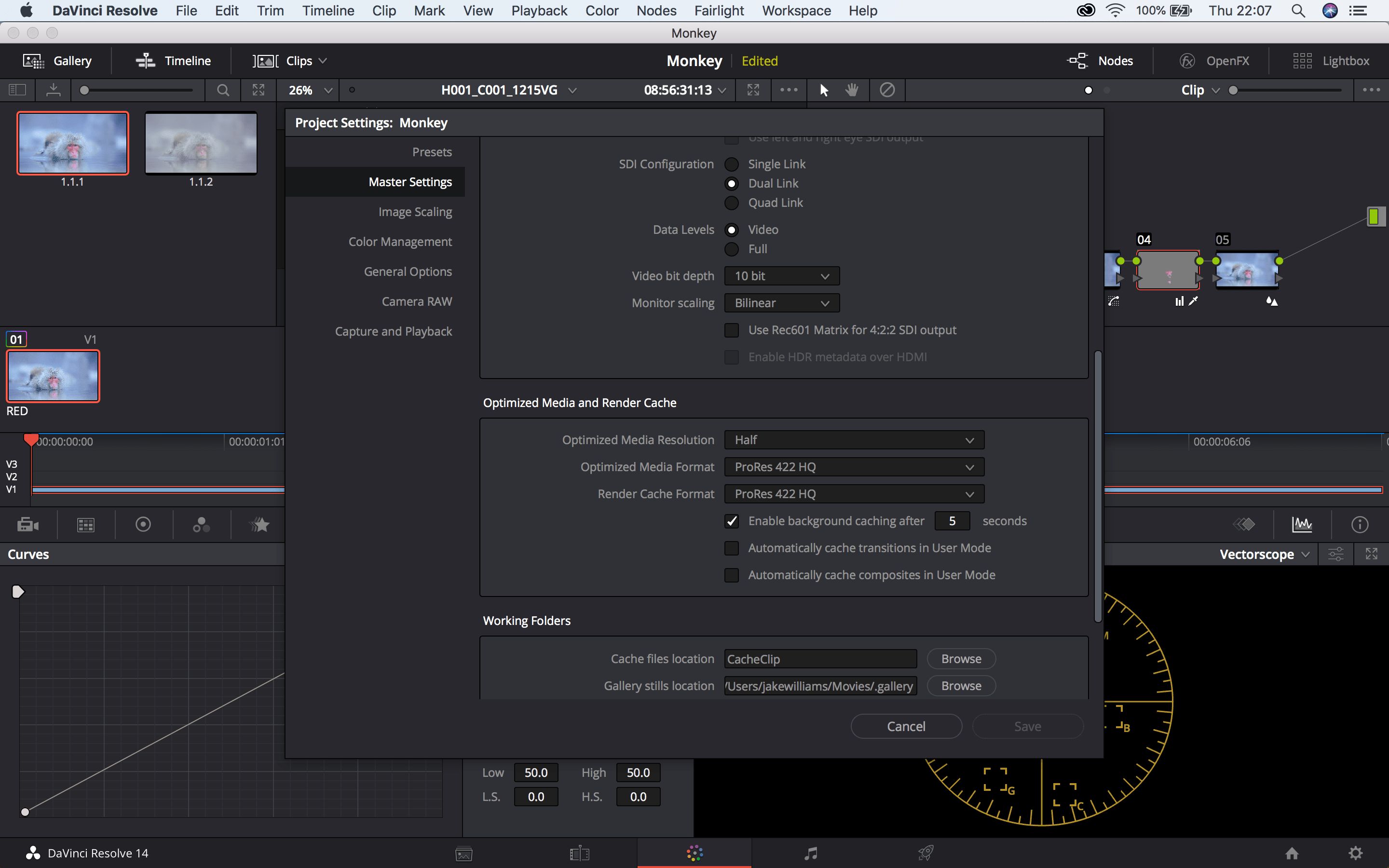
How to make DaVinci Resolve quicker
This tutorial demonstrates a way to make DaVinci run quicker. one issue with this tutorial is that for an older version of DaVinci so the ‘Optimized media’ section is not under general settings but under master settings. So, I’ve gone into DaVinci and loaded up a RAW file, gone into settings and selected my ‘Optimized media resolution’ as half. Going back to the clip it’s still finding it hard to run. After doing more research I’ve found this other tutorial.
This tutorial informed me to select ‘Use optimised media if available’ under the playback. Also under render cache to select ‘Smart’. This basically means that the footage will render out when your computer isn’t doing anything.
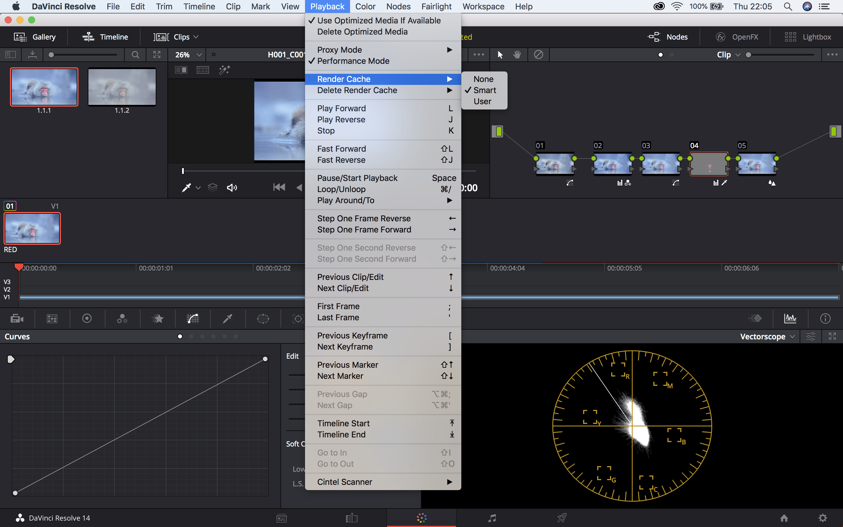
Without the render cache, my MacBook finds it difficult to playback. To make this easier I’ve lowered the optimised playback resolution which fixe the problem. I will continue my search for ways to make resolve run faster
Editing techniques
Smooth Zoom transition:
This tutorial demonstrates a way to smoothly zoom into a different shot. I found this tutorial when I was looking for a way to make my colour grading showreel look more interesting. The method of doing this involves using the effects replicate and mirror. These will be placed in an adjustment layer above the clips. Within the ‘replicate’ effect select the count to 3. The ‘mirror’ effect will need to be replicated 4 times. The reflection angle setting will need to change each time from 90 degrees, -90, 180 and 360.
In an adjustment layer above covering both clips make a keyframe on the scale setting where you want the transition to start and another where you want it to end. The first keyframe should be set to 100 and the next should be 300. You can see how I’ve used this below.
Camera Rotation Transition:
I intend to use this transition as part of a drug taking scene. I feel its reminiscent of a scene in Trainspotting in which the main character sinks into the ground or more recently Get Out. To achieve this I will need to use a green screen. As I’m not 100% confident in this process I will need to practise beforehand. I think this is a unique way to transition scene.
Walk by transition:
This transition is much simpler than the others in this post. A transition I already knew how to achieve. This video is used as a reminder to myself on how to if I forget. I was not intending to do this kind of transition as I felt it wouldn’t fit in. However, it’s a nice trick to know.
Camera Through Mirror:
I remember watching something that had a similar transition in. I feel it’s a good way to trick the audience and an impressive editing skill to be able to accomplish. When thinking about my film and the types of shots I will look to include this one. But, Like the rest of them, it will need practice first.
Freeze effect:
Similar reasons with the camera rotation transition. I feel this could be effective in the drug taking scene I intend to do. The main issue with this is needing a camera that shoots at 60FPS. This might not be possible to achieve however it is still something i intend to practise in the future.
Quick Whip:
This transition isn’t really using in narrative films. It’s very popular with YouTubers as its a quick and effective way to transition show seamlessly. The audience doesn’t notice the edits often. This method, to me has to be inspired by the term match cut, made famous by Stanley Kubrick in 2001: A Space Odyssey. Again I will test and practise this method when im able to film footage