DaVinci resolve: basics, what I’ve learnt passed to you.

So, once you’ve opened Davinci resolve it takes you to your homepage. This is the place where you can select projects or create new ones. When selecting a new project, it will take you to the interface.

Firstly, you need to bring the footage into the media pool which is where you’ll find all the clips in your project. Go to file and import media. Once the right clips are selected a box which says, “The clips are different to the current project settings would you like to change”. Always say change (unless you’re working with higher frame rate but want to work at 25 or something then change that in settings under ‘Master settings’) as once the clips are imported you cannot change the project settings.

If working with RAW files, the workflow will be different. I’m going to skip these stages as I’ve already made a post about that.

So, right click on the clip(s) and select create a new timeline from selected clips. This will create a timeline and now you can edit in the edit tab at the bottom of the screen. This also allows you to do colour correcting. Which is what time going to do. BUT, before so you need to make sure you’re monitor is calibrated. Then go into settings and colour management. Make sure ‘Timeline to Output Tone Mapping’ is set to ‘Luminance Mapping’. Underneath you need to set the number of nits your screen has. To find this out google it, for me I set this to 500. Underneath that set ‘Gamut Mapping’ to ‘Saturation Mapping’. And now we’re good to go.


When on the colour tab you might find the interface its crammed. To solve this, make sure at the top left the gallery, timelines and clips tab is not highlighted. These can stay open if you prefer some of them to be. I find the timeline to be useful so normally have that open.


let’s take a look at a few of the control panels. One of the most common panels you’ll probably be using is the colour wheels panel this is where you can adjust the lift, gamma, gain and offset. The gain controls the brighter parts of the image the gamma controls the mid-tones and the lift is the darkest parts of the image and so you have a lot of control over how your image looks with these three controls the offset moves everything all at once. The wheel controls the hue and saturation while the slider underneath the wheels controls the brightness. The cross next to the gain wheel allows you to select your white point and the cross next to lift can set the dark point.

The curves panel is split into 6 subsections;

  1. The standard curves panel
  2. Hue vs Hue
  3. Hue vs Sat
  4. Hue vs Lum
  5. Lum vs Sat
  6. Sat vs Sat

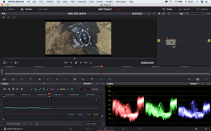
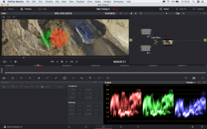
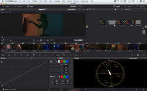
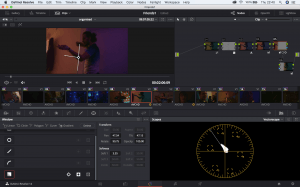
Screen Shot 2018-05-04 at 00.19.37 Screen Shot 2018-05-04 at 00.21.46


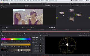
Next to the curves panel is the qualifier. This is sort of like a chroma key. Using the colour picker tool, you can select a colour and then change that using curves or colour wheels. You can use the tools to add, remover or feather the colour. You can use the sliders to assist with this as well. This method is used for setting skin tones.

Next is the window panel which lets you mask around a certain object. There are multiple ways to do this from squares, circles or gradients. The panel next to this one lets you track your mask to the footage.

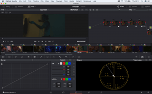
Screen Shot 2018-05-04 at 00.30.30

In the top right there is a tab which should be highlighted called nodes. This is similar to how layers work in photoshop. It allows you to stack different adjustments on top of each other. The little green box is your input which is the source meaning the clip you’re working with. Parallel to that is another green box which is the output. The nodes connect with each other in-between the 2 of these. If you right-click on the first node and select ‘add node’ a drop-down menu will appear labelling different types of nodes which you can choose from all of which are different from each other. These are


  1. Serial – This is a standard node which you will often start by using.
  2. Serial before – This adds a serial node before the node that has been selected.
  3. Parallel – This creates another node and it’s going to add a parallel mixer. A parallel mixer takes adjustments from all of the inputs and it’ll mix them together into a final output. The example below shows that the two colours are mixed together.
  4. Layer – If you right click on the parallel mixer there is an option to morph into layer mixer node. You can see from below they now work differently. They now stack on top of each other. The green is bottom with the red on top of it. This is because it just takes the information in the node, not the alpha and layers it.

Parallel node layer node node

The Layer node is a great way to separate skin tones from the rest of the grade. Below is an example of how I’ve used this.

Layer node used with skin tones


There some of the basics I’ve learnt from tutorials and playing around with the software. Below I will go through how to start grading with a shot.

Firstly, you might want to add contrast you the clips which means lowering the blacks and raising the whites. To do this make sure the ‘Parade’ scope is open. If there is a lot of space between the bottom line and the colours then the blacks need to be lowered, if there is a lot of space between 700-800 mark and the top of the colours then the whites need to be raised. There are various ways to do this.


  1. Go to colour wheels, move the ‘Lift’ wheel till the bottom of the colours in the scope just touch the bottom. Do the opposite for the ‘gain’ wheel so the top of the colours reach between 700-800ish
  2. Set saturation which is at the bottom of colour wheels tab to 0. Then go to the ‘Curves’ tab. Scrub through the clip until you find what you think is the darkest the image is. Hover over it with the curser which should now be a ‘Qualifier’ and click on the darkest part. Do the same for the whitest part. Now there should be 2 dots in the curves graph. The bottom one represents the darks and the top on represents the lights. Moves these to match what I’ve previously said in number one. Go back to the saturation and put it back up to whatever you like.


To see how I work in more detail watch the video below in which I use some of the methods talked about above.
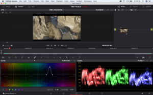
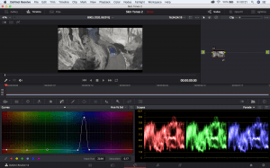


Filming my own footage

A few days ago I was able to film some footage of my own. I decided to film a party with a Canon C100. After importing footage I was met with a lot of limitations with what I was used to. This was mainly because it wasn’t RAW footage but also, the colour of the party kept changing due to the strobe lights. Due to this trying to get skin tones was very difficult. Looking back at the final look I feel that the skin tones I got are too reddish.

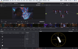
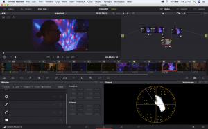
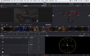
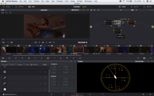
As you can see, the rooms are filled with reds, blues and greens. This is difficult to create or establish a general look. The image on the left is ungraded and the one on the right is. You can see from the nodes that I have done some masking. This made one half of the image one colour and the other half another. The main problem with this was that just 2 frames later the colour changes because of the strobe lighting.


Screen Shot 2018-05-03 at 22.37.17 Screen Shot 2018-05-03 at 22.37.23

Screen Shot 2018-05-03 at 22.40.32


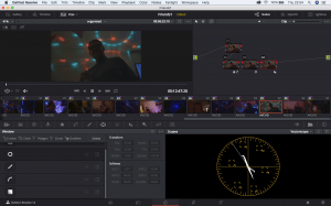
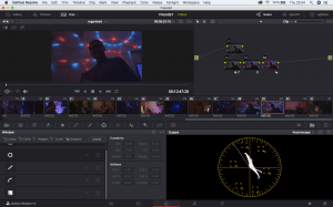
One correction I tried to be consistent with is warm colours. To achieve this I either raised the red output or lowered the green or blue, or raising the temperature. I was aware that at house parties in comedies especially they use higher reds to give the footage a homely, warm feeling. Another issue I had with this footage was how noisy it got in some places. I must have had the ISO setting too low for how dark it was. The footage has another issue with being out of focus, this was because it was filmed handheld and I was not used to pulling focus. I’m disappointed I was not able to show all the skills I’ve learnt so far from the footage I filmed myself. Below are some more examples of before and after grades being applied.

Screen Shot 2018-05-03 at 22.52.29 Screen Shot 2018-05-03 at 22.52.35  Screen Shot 2018-05-03 at 22.53.16 Screen Shot 2018-05-03 at 22.53.13 Screen Shot 2018-05-03 at 22.54.09Screen Shot 2018-05-03 at 22.54.07

DaVinci Resolve: Mole removal

While watching tutorials I discovered an aspect of DaVinci that I was not aware of; getting rid of marks, moles, stains on clothes etc. Below is an example that I did myself. Its a short clip of myself in which I’ve got rid of a small mole on my neck. To do this I masked around it, tracked it, blurred the mask, lowered the mid-tones and reds and raised the input saturation. This was a good opportunity to test the tracking capabilities. I decided not to use natural light as I wanted to check how far I could push it with neon lighting. I was surprised how well it worked. There is a slight ring outlining the mask that can be seen but for the purpose of this video, I left it.

Analysis of use of colour in film.

Colour is one of the most effective tools in conveying the mood of a story. Whether that’s through colour grading or use of colour pallets. Colours can; Elicit psychological reactions, draw focus to significant details, set the tone of the movie, represent character traits, show changes or arcs in the story (Risk, 2016).
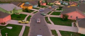
A great filmmaker should know what colour pallets to use with what film. Tim Burton is a great example. Burton’s films usually consist of; strange characters that are outcasts, gothic designs and the negative portrayal of pop culture. It can be argued that these three points can be contributed to his use of colour. His film ‘Edward Scissorhands’ best amplifies this. Tim Burton is known notably for the use of dark colours. However, this film uses pastel colours to represent 1960’s America and possibly the American dream.

Edward Scissorhands
The use of these colours conveys a friendly, un-threatening tone to the film. However, the neighbourhood grows less accepting of Edward showing that they are gentle on the outside but ruthless and judgmental on the outside. A connotation of society when unaccepting of others. The film’s colour is also reminiscent of Burton’s other work. It’s easy to notice what Burton likes to use so much because of all the other ones he avoids (CineFix, 2017).

Filmmakers often build a colour pallet involving a selected limited range of colours instead of using all available such as reds, yellows, greens, blues and purples. A colour pallet is a full range of colours that can be displayed on a device screen or other interface, or in some cases, a collection of colours and tools for use in paint and illustration programs (techopedia).

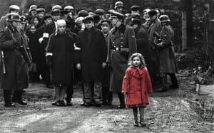
One of these more specific colour pallets is the selected saturation palette. This means that everything in the scene is black and white except for a specific object that gets the most vibrant colour. This is most notably used in the film Schindler’s list. Not necessarily as a way to move the narrative along but as an emotional effect as seen below.

red coat

Another example of this being used is Sin City. Which uses this technique emotionally and narratively. The decision to include any colour has clear intention so the audience has no choice to focus their attention on that.

Sin city

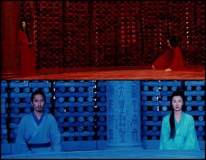
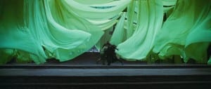
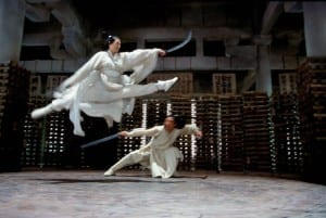
Next is that use of monochrome palette. This essentially means the use of one colour. David Fincher uses this to convey rigid worldviews of unbalanced characters. For example, in The Social Network. But one of the most impressive examples of this is from 2002’s Hero. The film tells and retells one story three times: how an anonymous assassin in ancient China overcomes three rivals. Two of the versions are false, one true. And they seem to come from different worlds: a red one, a blue one and a white one… Add to this a frame tale dominated by shades of black, and a series of flashbacks infused with vibrant greens, and you have a film that functions like a prism (Mackey, 2004). Despite the variety of colour used the film is consistent with the use of monochrome as seen below.

hero 1

hero 2

hero 3

The complementary colour pallet. You take one colour and combine it with its opposite on the colour wheel. For example, red and green, yellow and purple and the popular Hollywood blockbuster look, orange and teal (Blue). It’s fun to complain about and it can definitely get stale, but filmmakers use it for a reason, it’s the colour contrast that best emphasizes the look of human skin (Cinefix, 2017).

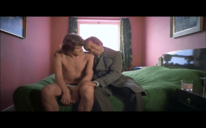
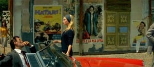
triadic and tetradic colour schemes are the use of having 3 or 4 colours. They can make for effective colour schemes, ones that tend to seem fun and carefree and stereotypically colourful films. The use of colours such as red, blue and yellow can easily be overbearing but in some cases when done right can be beautiful, striking, thoughtful and memorable. Such as films like A Clockwork Orange or Contempt.

Clockwork Orange

contempt

The neon colour pallet used bright colours and high saturation. Films such as Blade Runner and its sequel Blade Runner 2049 use this as a way to convey the futuristic setting. A personal favourite of mine aesthetically is Only God Forgives. The screen is nearly always black or immersed in a neon glow. The film uses this along with monochromatic compositions (CineFix, 2017). A consistency throughout the film is that there is no gentle colour, everything is harsh, contrasted an unnatural as seen below.

Only god Forgives

Pastel colour pallets work in as the polar opposite to neon. Neither very light or dark. This aesthetic is washed out and milky. Most notably the director Wes Anderson has become somewhat a master of using pastel colours in his films. One example of this is his masterpiece The Grand Budapest Hotel. Soft gentle forgiving colours never neon, rarely primary often peculiar and difficult to name. Andersen doesn’t use yellow so much as mustard, not pink so much as Rose, not red so much is burnt umber there’s a sophistication to his colour choices that is a little bit hipster (CineFix, 2017).

Now the different types of colour methods have been described it’s important to understand how or if these contribute to the films. Some film critics believe that you can often at times glance at a movies colour and instantly tell its genre; Warm red tones for romances, desaturated colours off apocalyptic films, blue cold tones for Horrors, fluorescent greens for sci-fi, yellow tones for film based in the desert saturated vibrant red tones for comedies and for everything else orange and teal (The Verge, 2015). At the start I stated colour can; Elicit psychological reactions, draw focus to significant details, set the tone of the movie, represent character traits, show changes or arcs in the story.

Colour was initially used to show the dreamlike quality of cinema. The fictional visual medium was the pinnacle of escapism, so colour was used to show how distant from our reality it was. It didn’t take filmmakers too long to discover that colour was an essential component of storytelling (Channel Criswell, 2015).

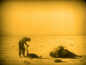
Benjamin Christiansen a Danish director who made films between 1911-1942 realised our inherent psychological reactions to different colours. We would feel much more on edge when the screen was covered in red which contrasted to the much more tranquil shots submerged in blue (Channel Criswell, 2015). Filmmakers quickly caught on that colour was a way to symbolize and thus a new way of metaphoric storytelling was born. The first film to show this was Greed (1924) by Erich von Stroheim. This film is considered one of the finest and most important films ever made. It follows the story of a man whose wife wins the lottery. The money is hand-tinted a golden colour. By the end of the film as the man’s possessiveness grown the entire film is engulfed in a yellow tint, symbolizing the man’s consumption. Humans will always have distinctive psychological reactions to certain colours and so particular colours are often used in a very particular way. But, that doesn’t make colour use exclusive. For example, red seems to be the colour that we have the strongest reaction to but where one may use it as a depiction of hate and cruelty another may use it to show passion (Channel Criswell, 2015).


Greed


CineFix (2017). 10 Best Uses of Color of All Time. YouTube, [ONLINE] Available at: https://www.youtube.com/watch?v=tILIeNjbH1E&t=637s. [Accessed 24 April 2018].


Channel Chriswell (2015). Colour In Storytelling. YouTube, [ONLINE] Available at: www.youtube.com/watch?v=aXgFcNUWqX0. [Accessed 24 April 2018].


Mackey, R (2004). FILM; Cracking the Color Code of ‘Hero’. New York Times, [ONLINE] Available at: https://www.nytimes.com/2004/08/15/movies/film-cracking-the-color-code-of-hero.html. [Accessed 24 April 2018].


The Verge (2012). How filmmakers manipulate our emotions using color. YouTube, [ONLINE]. Available at: https://www.youtube.com/watch?v=0ZZgiSUyPDY. [Accessed 24 April 2018].